What is Scrollytelling?


👋Heya, have you heard of scrollytelling? Is that a typo? Do you mean storytelling? No, I actually mean scrollytelling. I stumbled upon this fascinating concept while exploring the Tableau Extension Gallery, a treasure trove that allows users to enhance the functionality of Tableau by integrating third-party applications. Not only that, but it’s also a major productivity enhancer—for example, creating a Sankey chart using native Tableau features takes forever. So much data prep is involved, but with an extension, it can be achieved in a matter of minutes! While the Tableau Extensions themselves are certainly worth a discussion (you can check them out here), I want to focus on scrollytelling today.
Here is what we'll cover:
- What is Scrollytelling and Why Scrollytelling?
- Core Elements of Scrollytelling
- When to use Scrollytelling
- 4 Scrollytelling Examples
What is Scrollytelling and Why scrollytelling?
Scrollytelling is a unique form of data storytelling that unfolds a narrative through the act of scrolling, often integrating data and visuals in a way that progressively engages the reader. It’s not just about reading or viewing; it's about discovering and interacting.
I find scrollytelling incredibly powerful. The interactive element of scrolling creates an immersive experience. Having scrolled through quite a few of these, I’ve often found myself completely absorbed. You’ll see what I mean when you check out the examples I’ll share later—I think you’ll nod in agreement.
Another cool aspect of scrollytelling is that it gives users a sense of control, allowing them to explore data at their own pace. This enhances their engagement and immersion in the content, which is quite different from traditional data storytelling where the storyteller controls the narrative.
Now that we've covered that, let's look at the architecture of scrollytelling.
Core Elements of Scrollytelling
There are several core elements to scrollytelling:
Narrative Flow:
This involves structuring the story with a clear beginning, middle, and end. Typically, you might start by introducing the main topic with basic data to set the scene. For instance, a discussion on climate change could begin with a simple chart showing temperature changes over time. As the reader scrolls, more detailed information like, the effects on different regions or species, is introduced. The narrative should conclude with a summary that ties everything together and possibly suggests actionable steps based on the data.
Visualization Techniques:
This element focuses on presenting data visually in a way that unfolds interactively as the user scrolls through the story. Scrollytelling usually starts with straightforward visuals to ease readers into the topic. As the story progresses, it incorporates more complex and interactive visuals. For example, a static graph might evolve into an animated one that illustrates changes over time, helping users grasp more complex information smoothly.
Interactivity:
This feature engages users and provides them with a sense of control. It includes elements, like hover effects and clickable components that open up more detailed data. Dynamic elements that change as you scroll can also enhance the experience, making it more engaging and giving users a hands-on feel.
With these key elements reviewed, it’s time to think about when actually to use scrollytelling.
When to Use Scrollytelling?
Here are four situations where scrollytelling can be very effective:
Chronological Narratives:
This format is ideal for stories that have a clear timeline, as scrolling naturally mimics the passage of time; examples like the history of a company or changes in global temperature work well here.
Comparative Analysis:
Scrollytelling excels in this area by introducing one set of data at a time, making comparisons clearer and more striking as new information is revealed with each scroll. For instance, comparing population growth in different cities or showing before-and-after deforestation scenarios can be impactful.
Interactive Infographics:
This approach transforms static infographics into dynamic stories that unfold as the user scrolls. The gradual revelation of data moves the user to explore further.
Transformative Data Visualization:
This scenario is about making complex concepts more accessible and engaging, such as explaining how a car engine works or the basics of machine learning. Even absolute beginners can gain a clear understanding through this method, making it an excellent revision tool.
Are you ready for some examples?
4 Scrollytelling Examples
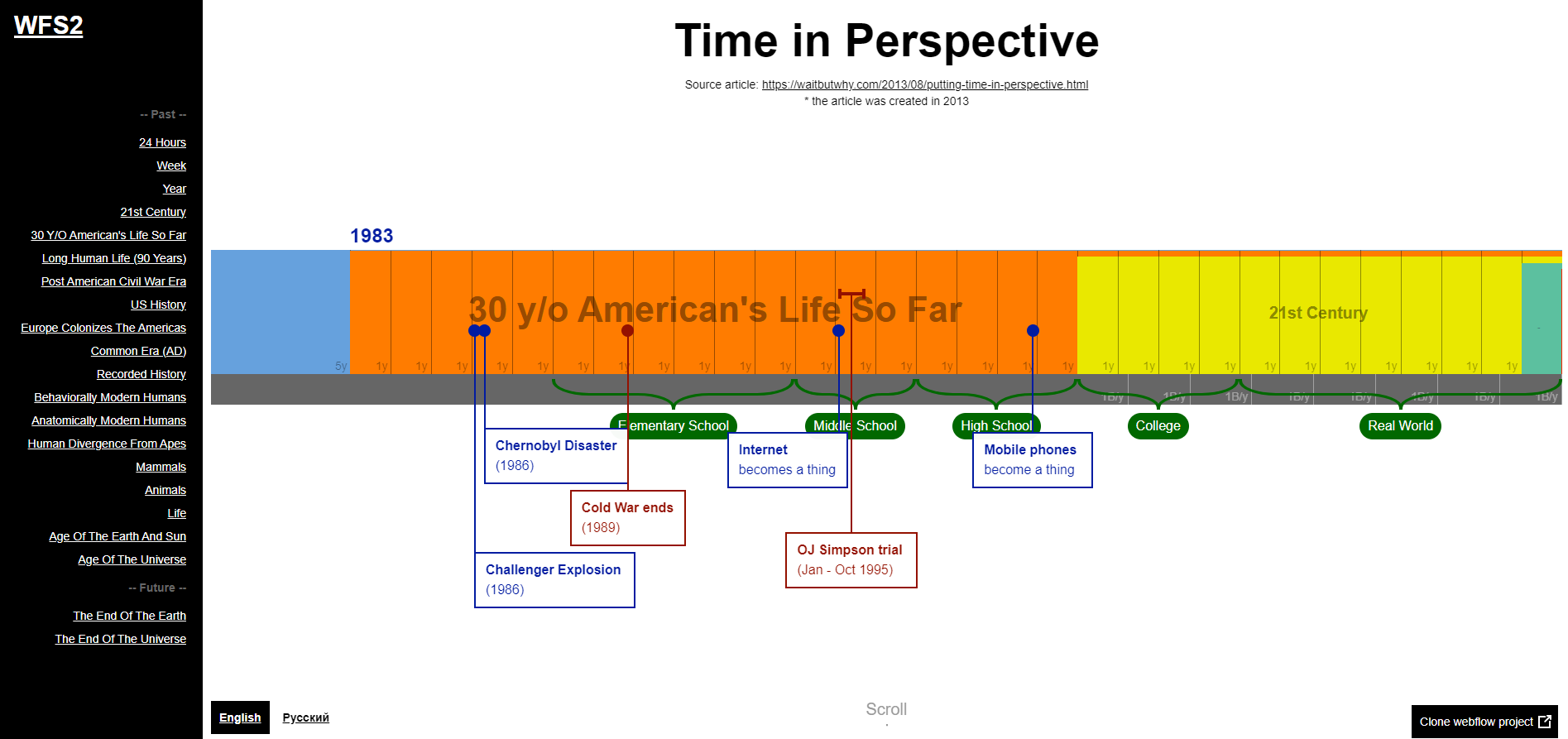
Time in Perspective
Time in Perspective is a chronological narrative that uses scroll-triggered animations to stretch the timeline, reveal milestones, and show how each era fits into history. Explore the unfolding of time in this engaging format here.
If the Moon Were Only 1 Pixel
If the Moon Were Only 1 Pixel by Josh Worth is an example of comparative analysis. This horizontal scroll offers a journey through the vastness of the universe, representing the moon with a single pixel and offering a unique perspective on the cosmos. Experience the scale here.
The Water We Eat
The Water We Eat is a powerful dynamic infographic revealing that 92% of the water we use is invisible and hidden in our food. It illustrates how much water is needed to produce various foods and offers insights on how to support water conservation. Discover more about our water consumption here and how we can support water conservation.
A Visual Introduction to Machine Learning
Does learning about machine learning seem too daunting? This transformative data visualization scrollytelling, breaks down the complexity, using a model to distinguish homes in New York from those in San Francisco. Don't believe me, check it out here.
There you have it! I hope you find scrollytelling as captivating as I do. It's a fantastic way to tell a story, combining various elements to make data engaging and memorable. Scrollytelling truly brings data to life, offering a dynamic way to explore information. So go ahead, give it a scroll, and see how the data comes alive in a whole new way!