Cohort Analysis- What is it? What do you do with it? How to read it?

My first encounter with Cohort Analysis occurred during a Tableau course I took a few years back. Before that, I had no clue what it was all about. I was blown away by how powerful and insightful it can be. Sadly, I don't get to use this kind of analysis much at work. But sadly, I don't get to use this kind of analysis much at work. But it's a skill worth picking up if you're into data. I know I've got to improve, so I revisited this topic and practised cohort analysis on Tableau this weekend.
So, in this blog, let's visit:
- What is Cohort Analysis
- What you can do with Cohort Analysis
- How to read it and examples
What is Cohort Analysis?
Cohort Analysis is a form of analysis that focuses on analyzing groups of users who share specific characteristics or experiences within a defined timespan. These characteristics can be pretty much anything, but " cohort " often refers to groups based on time, like the month or week users first signed up. If we group people based on factors unrelated to time, we call it segmentation instead. Cohort Analysis is really popular, especially for online businesses and services, as it helps understand how different groups of users interact and change over time. It's a handy tool for getting insights into user behaviour patterns.
What Can You Do With Cohort Analysis?
There are several things you can understand from cohort analysis.
Understanding Customer Behavior: It helps understand how certain groups of customers behave and evolve over time, offering insights into customer retention, lifetime value, and engagement.
Improving Product or Service: By identifying patterns and trends in different cohorts' behaviour, companies can pinpoint what works well and what doesn't, leading to more informed decisions on product development or service improvements.
Targeted Marketing: Cohort analysis can reveal which groups of users are most valuable or most likely to churn, enabling more targeted and efficient marketing strategies.
Performance Measurement: Businesses can measure the impact of specific actions or events (like launching a new marketing campaign) on different cohorts to understand which strategies are most effective.
How to Read Cohort Charts and Examples
I've put together a few different cohort analyses using Tableau and the Superstore datasets:
- Customer Cohort Retention Analysis
- Net Revenue Retention
- Cumulative Lifetime Revenue by Cohort
We will look at all of them, but before we do, I'll show you how to read them.
How to Read Cohort Charts
I have created a simplified example of a Customer Cohort Analysis, focusing on customer retention over months. Our hypothetical company has customers who first purchased from January to March. We'll track these customers over three months to see how many continue to make purchases.
Cohort Analysis Table
| Cohort | Month 1 | Month 2 | Month 3 |
|---|---|---|---|
| Jan | 100% | 60% | 45% |
| Feb | 100% | 50% | 30% |
| Mar | 100% | 40% | 25% |
How to Read the Table
Cohort Column: Lists when the group of customers made their first purchase. For instance, the 'Jan' cohort represents customers who first purchased in January.
Month 1, Month 2, Month 3 Columns: Show the percentage of customers from the original cohort who purchased in subsequent months. Month 1 always shows 100% since this was when the cohort made their first purchase.
Examples
Now that's out of the way, let's look at the cohort analysis I created in Tableau using the sample Superstore dataset.
Customer Retention
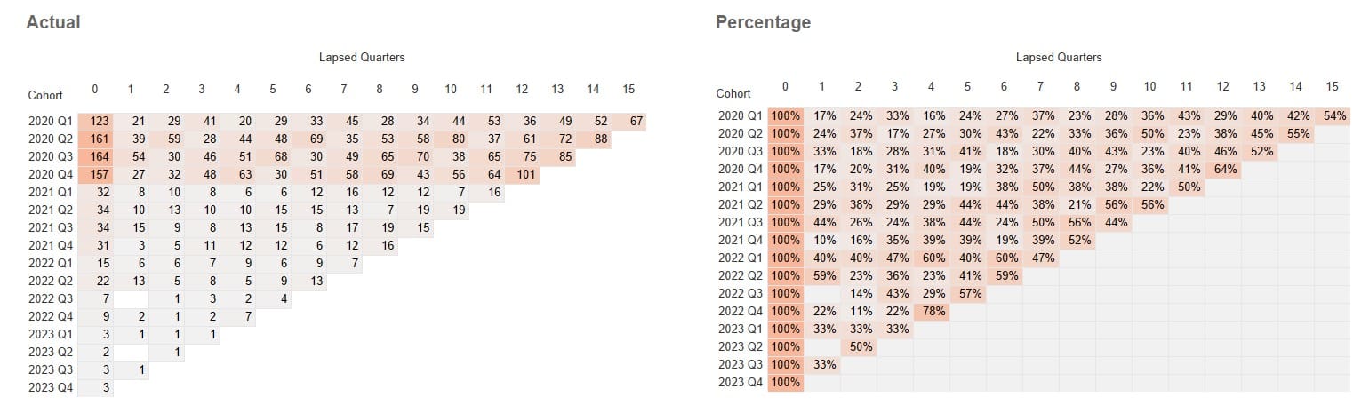
We define the cohort by the quarter in which the customers made their first purchase. Each column represents several lapsed quarters from when customers first purchased.
In the Actual table (left), the numbers represent the count of customers from that cohort over time. On the right, the percentage tells the percentage of the original customer count in the cohort. These two tell us about customer retention.
Here are a few insights we can draw:
-
Initial drop-off in percentage: The percentage of individuals who have lapsed after the first quarter (column "1") is relatively high across all cohorts. This is seen in the steep drop from 100% retention in column "0" to lower percentages in column "1". For example, the 2020 Q1 cohort drops to 17%, meaning 83% of original customers did repurchase just after one quarter.
-
Long-term engagement: Looking at the far-right columns, you can assess long-term engagement or attrition. For instance, the 2020 Q1 cohort still has 67 customers with repeat purchases by the 15th quarter. This indicates the long-term loyalty or engagement within that cohort.
-
Cohort Comparisons: By comparing different rows, you can evaluate whether specific cohorts perform better or worse than others. For example, the 2020 Q2 cohort starts with 161 individuals and by the 13th quarter, there are 72 customers, whereas the 2020 Q3 cohort starts with 164 customers and ends with 85 customers in the 13th quarter. It suggests that the Q3 cohort retained slightly better than the Q2 cohort over the same period.
Net Revenue
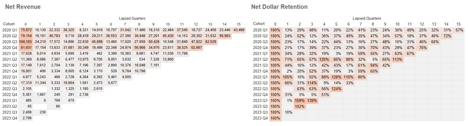
The left table provides each cohort's revenue over time. The right table calculates a percentage of the quarter's revenue over the revenue generated when they were first acquired. For example, the 2020 Q1 cohort retained 13% of its revenue in the first quarter, which is $10,130/$75,975.
Here are a couple of interesting observations:
The 2021 Q1 and 2022 Q2 cohorts show an uptick in spending (4, 5, 6) after their initial quarters. This could indicate a successful marketing or seasonal promotion resonating with them. It's worth diving into what happened during those times that might have re-engaged these customers.
The 2023 Q1 cohort, following a significant decline in revenue in the 1st quarter, bounced back in spending in the second and third quarters. It's worth exploring if any marketing efforts or customer engagement strategies around that time could explain this significant increase in engagement. If the cause could be traced, replicating it could be beneficial.
Customer Lifetime Revenue
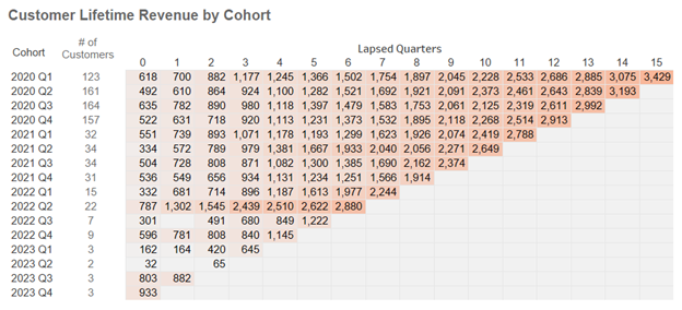
The above table looks at customer lifetime revenue –the total revenue a cohort generates, tracked over the entire duration of their relationship with the business.
This helps businesses understand which cohorts are the most valuable and whether specific initiatives like marketing campaigns, product launches or changes in customer service strategy have a long-term impact on revenue. Do you notice 2022 Q2 seem to have much higher lifetime revenue than other cohorts?
And there you go –a snapshot of what cohort analysis can reveal. Through this blog, I hope you can appreciate how powerful this type of analysis can be for a business. It allows you to see how customers engage over time, which strategies work, and where there's room for improvement. It's a strategic tool that can drive informed decisions across the business.