Introduction to Exploratory Data Analysis with Seaborn

In my previous blog, I talked about the various data visualisation libraries available in Python, and I highlighted Seaborn as the one I'm focused on learning first. If you haven't checked it out yet, you can find it here: Data Visualization Libraries.
Since then, I've delved into learning Seaborn and want to share what I've discovered in this blog.
But before I do, here is a quick note on how I approached learning this. In the past, I used to tackle learning without any particular strategy. My method was to cram as much information as possible into my brain. It took me a while to learn that it wasn't very effective. I wasn't selective with contents to learn. Now that I've gained some wisdom, I have a different approach. I start with a few Google searches to get a high-level understanding of the main topics of what I'm to learn. For example, with Seaborn, there could be different plot categories, stylising categories, etc. The intent is to create a structure to help me organise my learning. It allows me to compartmentalise information and create a roadmap for me to follow.
I also keep reminding myself of the purpose behind my learning. With learning Seaborn, my goal is to be able to perform exploratory data analysis quickly, i.e., understand the nuances and characteristics of the data. So, I'm the audience, not other people. With that, I don't need to dive deep into the styling aspect or advanced visualisation techniques yet. Keeping my goal in mind helps me stay focused and avoid going off on tangents and going too deep and too quickly that I'll overwhelm myself.
As I learn new concepts, I try to relate them to what I already know, a hack that aids long-term retention.
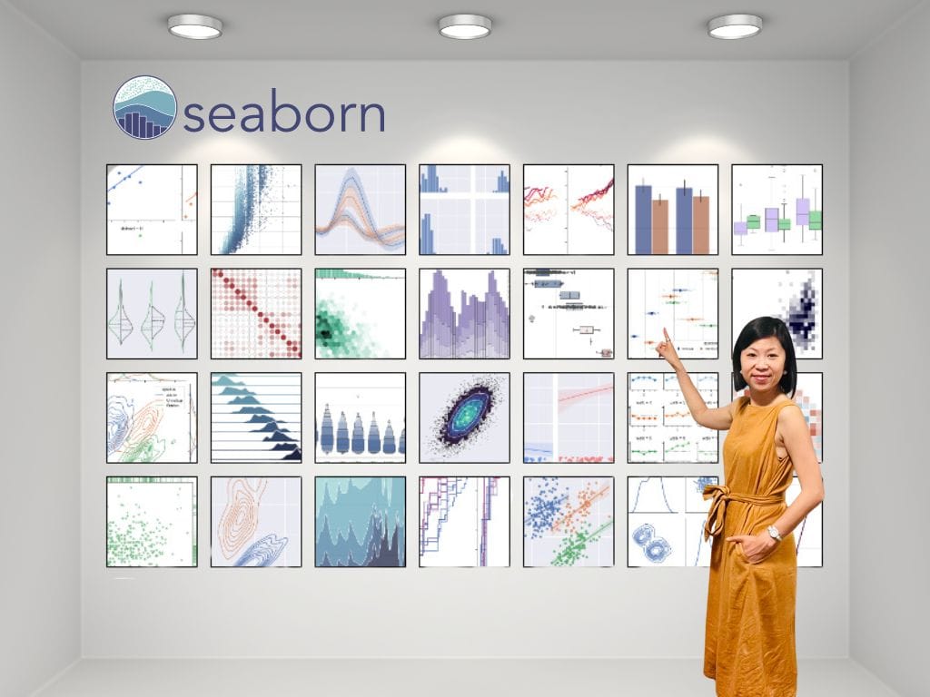
Ok, now to the main event- Seaborn. This blog is slightly different from my others- it's a bit more technical. I'll share some helpful tips and insights I've encountered while learning Seaborn. For added clarity, I'll share my Google Colab notes. Google Colab is short for Google Colaboratory. It is a free browser-based application that allows you to write and execute Python codes.
A quick note: if you're thinking about learning Seborn, you'll need a basic grasp of Python and nodding acquaintance with two key libraries (code packages)- Numpy and Pandas.
The Numpy package is for scientific computing, in simple term, it means math stuff. The Pandas package is for data wrangling and analysis.
Alrighty, here are the specifics of what we will cover:
- Introduction to Seaborn
- Datasets
- Seaborn Plot Types
- Seaborn Exploratory Data Analysis Plots & Customization in Google Colab
Introduction to Seaborn
The Python visualisation landscape is complex and overwhelming. Below is an illustration that:
- highlights the complex ecosystem
- helps you see where Seaborn stands in this landscape.
- shows how Matplotlib is foundational in many visualisation tools, including Seaborn.
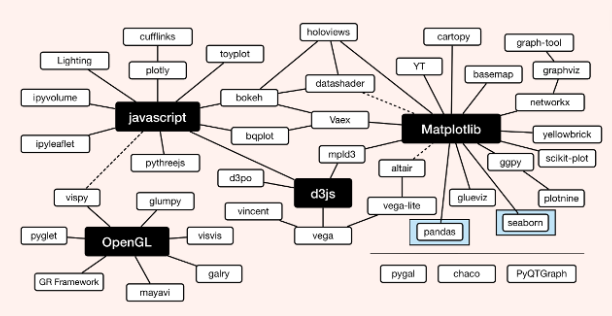
Matplotlib has been around the block for quite some time. It's like the OG of visualisation libraries, and Seaborn builds on top of it to whip up better-looking statistical visualisations. Because it's built on Matplotlib, it is helpful to understand some of the underlying Matplotlib constructs.
You might wonder why not just stick with Matplotlib. Well, as I explained in my last blog, Seaborn simplifies the process of complex visualisation, it's much easier to learn than Matplotlib. It offers built-in styling themes and colour palettes that enhance plots' appeal without too much effort.
Datasets
Seaborn provides several built-in datasets that you can use to practice and experiment with data visualisation. These datasets cover a range of domains, here are a few to give you an idea of the options:
Tips: A dataset containing information about tips given to restaurant staff, including total bill amount, tip amount, gender of the payer, whether the party was a smoker, day of the week, time of day, and the size of the party.
Iris: A dataset containing measurements of iris flowers (sepal length, sepal width, petal length, petal width) along with their species.
Titanic: A dataset containing information about passengers aboard the Titanic, including details such as passenger class, sex, age, number of siblings/spouses aboard, number of parents/children aboard, fare, cabin, and survival status.
Flights: A dataset containing flight information, including the year, month, day, and number of passengers for each month from 1949 to 1960.
Exercise: A dataset containing information about people's exercise habits.
Planets: A dataset containing information about exoplanets discovered by various observational methods. It includes details such as the method of discovery, the number of detected planets in the system, the orbital period, the mass of the planet, and the year of discovery.
FMRI: A dataset containing functional magnetic resonance imaging (fMRI) data from an experiment where participants performed a working memory task. It includes brain activity measurements over time for different regions of interest.
Seaborn Plot Types
In Seaborn, there are two key types of plots:
- Figure-level functions (FacetGrid)
- Axes-level functions (AxesSubPlot)
Understanding the distinction between them is very helpful because certain functions like customization function varies depending on the type you're dealing with.
Figure-level Functions
These functions create entire figures, the overall canvas or container for your plots.
When you use a figure-level function, seaborn automatically creates the figure and any necessary axes.
There are three figure-level functions: seaborn.relplot(), seaborn.displot and seaborn.catplot(),
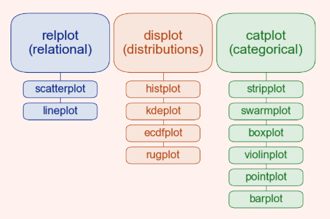
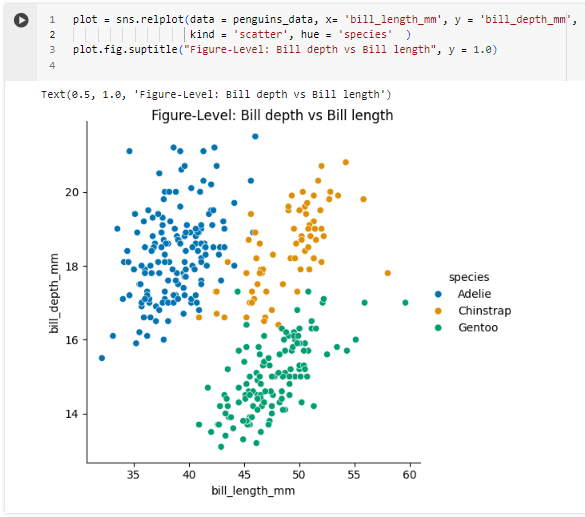
These functions are often convenient when creating complex plots involving multiple subplots (aka facets). Here is an example:
Axes-level Functions
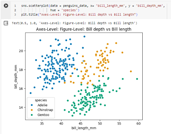
These functions create individual plots (axes) within a figure.
They give you more control over the individual components of your plots, such as the axes limits, labels, and titles.
Examples of axes-level functions include seaborn.scatterplot() and seaborn.boxplot().
With axes-level functions, you have to create the figure and axes yourself before calling the plotting function.
In simple terms, you can think of figure-level functions as "big-picture" functions that handle creating entire plots for you, while axes-level functions give you more fine-grained control over the individual parts of your plots.
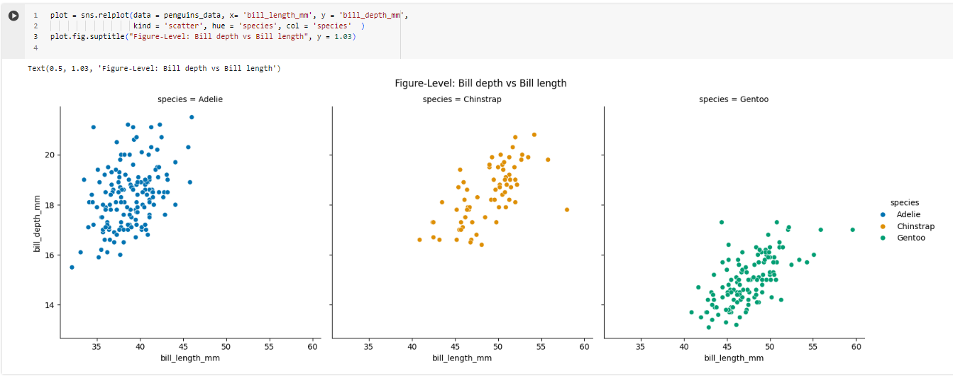
In Seaborn, there is more than one way to do the same plot. I've noticed that one way is through figure-level function, and the other is through axes-level function.
Let me show you. Below are two scatterplots of the Seaborn penguins dataset. The first image is of figure-level plot, and the second image is of axes-level plot.
Seaborn Exploratory Data Analysis Plots & Customization in Google Colab
For this section, I'll go over how to create common plots helpful for exploratory data analysis and the basic styling functions.
There you have it. This blog may be a bit more technical than what you're used to, but I hope it has sparked your interest and offered some inspiration. If you find it intriguing, you can find plenty of resources on YouTube. Alternatively, you can explore the Seaborn documentation for more detailed information.